Home Programs Tools Data About
Mean reversion is one of many ways to model price movements of stocks. The philosophy behind mean reversion is that stock prices tend to move around an average (mean) rate or line. While this claim can be dubious on individual, cutting-edge companies due to the possibility of discoveries leaping the company’s growth forward (and thus diverging from the historical average growth), stable companies and broader indices are more suitable candidates for the mean reversion model.
The mean reversion model has many forms, but one such version is to take the price data and calculate the line of best fit (aka trendline/regression line) by using the least squares regression method. This creates a line that attempts to minimize the distance from as many points as possible. Tools like Microsoft Excel and Google Sheets have built in functionality to calculate this easily. Then, the user can use the best fit line to get an idea of what the average price is, and from there decide if the stock is above the average (and thus has a higher possibility of stagnating or going down in price) or below (and thus has a higher possibility of going up in price).
However, two problems appear when websites attempt to model indices such as the SP500. The first problem is they do not properly account for inflation. Without adjusting the lines for inflation, the best fit line falsely under reports the average, thus increasing the likelihood of the stock price being flagged as overvalued compared to the mean. The second problem is that websites may not account for dividends and the effects of the reinvestment of those dividends. This will result in data points during which dividends were primarily the driver of stock returns being undervalued and thus dragging down the average line.
I attempted to solve both problems with this model. First, I inflation adjusted all data using my first data point as the reference by which all inflation ratios are calculated. Secondly, I utilize the ^SP500TR (SP500 Total Return Index) provided by Yahoo Finance to have an index that automatically accounts for dividends within the growth of the index. While solving these two problems gives a mean reversion model that provides plausible sentiment of the broader market state, several issues arise.
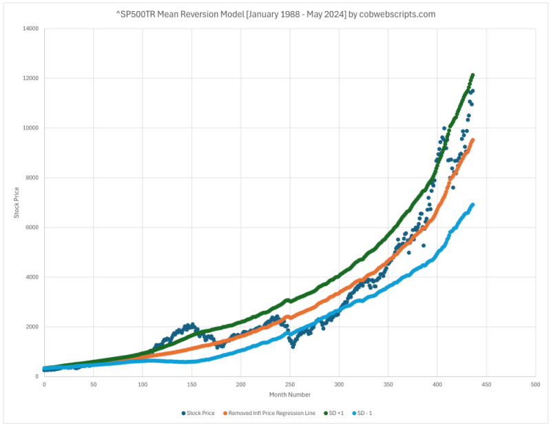
First, when you inflation adjust data and create the trendline, you ultimately need to remove the inflation adjustment so it can be compared back to the actual index price. If you adjust based on the real inflation of each data point, it results in a slightly jagged trendline, which can be noticed in the image. Secondly, projection of the trendline into the future becomes difficult because you have two entangled variables (inflation and stock price). Thus, you need to not only extend the inflation adjusted line, but also handle how to remove the inflation adjustment on the extended/projected part of the line, so that it can be usefully converted back to the same nominal price as the index itself. I ATTEMPTED to solve this by first removing the inflation adjustment on the part of the trendline that we have the data and doing ANOTHER regression on the newly inflation removed trendline. It requires special adjustment so that the line gracefully picks up where the last point left off, which I call “last point linear regression”. I believe these problems stem due to hitting my limit of statistics knowledge and more advanced study would most likely provide better tools. Nonetheless, I believe the line follows a reasonable enough pattern to be used to extend the trendline out into the future.
This leads me to the script below. Everything explained above is calculated for the user, allowing them to see the inflation adjusted mean reversion model on a dividend included and reinvested SP500 index (aka the SP500 Total Return index). The earliest available data point is January 1988. The latest data point may be one to two months behind current times due to the release schedule of inflation data. Also take note of the standard deviation. The standard deviation adds to the usefulness of the model by showing one standard deviation above and below giving note of when the index is noticeably higher or lower than the average, signaling the increased possibility of a decline/stagnation or rise, respectively. An added benefit of using one standard deviation is if the user chooses to consider other multiples of standard deviation, they need only to multiply their desired scale factor.
Two things of note regarding standard deviation. The first is that each standard deviation point was calculated up to said data point. I believe this provides a more historically accurate representation of the variance rather than doing a single standard deviation across the entire data set, which would render a large, homogenous but mostly useless band for the data set. Secondly, as you can notice by the shape from the image above, the standard deviation can rise/fall/stagnate based on how VARIED the data points are, rather than the direction they are going. I had to make an educated guess when it came to projecting standard deviation past the current data points (using similar regression techniques used for the stock price), and thus the standard deviation estimates should be viewed with this consideration in mind.
Last updated data point: November 2024.
--
| Fair Value Price (FVP) | Standard Deviation (SD) | FVP + SD | FVP - SD |
|---|---|---|---|
| -- | -- | -- | -- |
Inspired by:
Sources: